How to Write Effective Call-To-Actions and Increase Conversions

Key takeaways
- When coming up with a call to action (CTA), it’s essential to keep it simple without being too dull.
- 90% of all website visitors read your headline and call to action buttons. Even though they don’t read the details, they will skim through what you’re offering and what you want them to do.
- To create an engaging call to action, always start with a strong verb and provoke a strong response from your visitors.
- Ensure that your CTA stands out against other elements on your page and tells visitors what to expect when they click on it.
We’ve all seen bland examples of a call to action (CTA). Things like “Shop Now,” “Subscribe,” and “Learn More” are getting pretty old.
If you’re looking for ways to get more clicks and know that those boring stuff just won’t cut it, you’ve come to the right place. We’ve compiled some best practices from across the marketing space, from landing pages to Google Ads that will inspire you to level up your game.
So, let’s get into our guide and increase your clicks and engagement for your ads and landing pages.
What’s a call to action?
A call to action is a clickable button or link on your site, ad or in your email. You want your visitors to click on your CTA and call them to take action. Generally, CTAs look like this:
- Download
- Submit
- Sign up
- Subscribe
Or some longer versions:
- Click here to learn more
- Don’t want to miss an update? Subscribe now
The problem with many CTAs across the web is that they’re stripped of style and don’t connect with visitors enough. On the other hand, you should look for calls to action that are simple but have the magic spark.
Something about them gets users to click on the buttons and turn them into leads. You want these leads in your marketing funnel, so you need to think about your call to action, as they are powerful tools in digital marketing.
90% of website visitors read headlines and call-to-action buttons, according to Unbounce. They might not look at all the details, but they skim on what you shout about at the top and find what you want them to do. This means that 9 out of 10 visitors will fix their eyes on your CTA, which is a big reason why you should work on engaging CTAs.
The last thing you want is to get visitors on your page due to your paid ads or SEO efforts but only to watch them bounce because of boring CTAs. When that happens, your CTA will look at you with sadness, and your ad budget will go down the drain.
So, let’s figure out how to turn those unclicked buttons into effective click-through rates (CTR).
Why are call-to-actions important?
A call to action leads your visitors to become customers. It helps keep users moving towards your goals so they won’t steer away and get distracted.
Here are examples of how a great call to action can influence your site:
- According to HubSpot, personalized call-to-actions perform 202% better than generic CTAs.
- CTAs on long landing pages increased conversion rates by 80%, according to CXL.
Now, let’s look at how you can create some irresistible CTAs.
Create effective calls to action for your site
Every call to action offers a purpose. Whether you work in a tech company, the SaaS industry or other online business, the purpose of knowing what works and what doesn’t will change how you design your landing pages and ads.
Here are 4 key takeaways for creating some terrific calls to action.
Start with a strong verb
You don’t have much time and space to get your message across. So get to the point and tell your visitors what you want them to do by leading your CTA button with an action verb. There are plenty of action verbs depending on the type of business you run and the type of action you want your customers to do. Here are a few examples:
- To promote a newsletter or piece of content: Your CTA should consist of words like “download” or “subscribe.”
- To a service-based business: begin your CTA with “call now” or “book an appointment.”
Avoid saying that something simply exists, such as “Our newest products are available.” This won’t get people to take action. Instead, things like “click here for our newest product” will likely improve your click-through rate.
Add emotional or enthusiasm-provoking words
To increase clicks and conversions, you’ll need to provoke a strong response from your visitors. Some emotional copywriting skills will help create enthusiastic CTAs.
For example, when someone is looking to spend their holiday with their family, they’ll get super hyped when coming across a CTA like “Plan your dream family vacation today!” They’ll instantly click your ad’s link and make a booking. Other ways you can tap into emotion with CTAs include:
- Reduce risk and insecurity
- Build trust
- Create urgency
- Offers value
Remember to add punctuation. Add an exclamation point, arrows, and icons to your CTA if needed to add more context and excitement, as it will make it stand out more.
Give your visitors a reason to click
In other words, tell users what to expect once they click on your call to action. Will it help them save money, help them with their jobs or help them lose weight? This will heavily tie in with the value you offer or unique selling point (USP). A USP is a crucial element of acquiring new leads, so create a CTA that combines your USP, a recipe for increased clicks.
For example, a CTA like “Contact us to save money now!” not only states the action your users should take (contact us now) but also provides them with a reason to click (save money).
Be singular and create contrasting buttons
Only use one call to action per page, email, and form. When you add another CTA, your visitors’ attention ratio will decrease, and the chance of them converting to a single CTA will lessen.
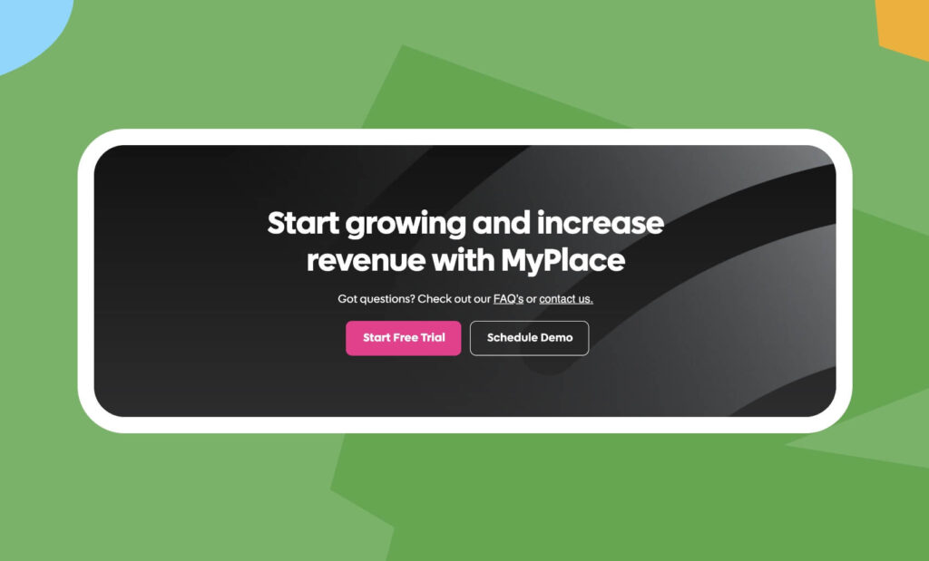
Also, ensure your CTA button stands out against other elements on the page. Ideally, the button color should be the opposite color of the background. This is known as complementary colors (color wheel contrast).
Is your site bright blue or more like a bright blue gradient? Then, try adding a bright yellow button to it! You can try out the Canva Color Wheel or Adobe Color. Click any place on the wheel and choose your background color, then pick the complementary color and grab the hex code. That’s what the color should be.
Call to action examples
Now, let’s get into our gallery of effective calls to action that will get your visitors clicking! Scroll down to browse through our collection of CTA examples from clients that have proven to engage users.




Now, create your own CTA!
And there you have it. Now you know the importance of effective CTA and ways to adjust them based on your industry. Try creating one or two that will likely convert and test your CTA to determine which is better with A/B testing.
Have you created the ideal CTA recipe? What are your tactics, and how does it impact your business? Let us know!

