A Quick Guide to Psychology for UX Design
Key takeaways
- Understanding basic psychology principles can help you determine how users behave or react to a product, ultimately leading you to design a better user experience.
- Hick’s law states that the more choices you present, the higher the cognitive load. Therefore, limited and clearer options will offer a better user experience.
- Gestalt’s laws state that the human mind tends to group certain elements to process information more easily. This includes color, shape, the distance between elements, and others.
- Present the most important information at the beginning and end of your site, as users tend to remember this the most.
- Delivering the perfect balance of unfamiliar and familiar design is important, as users tend to gravitate towards something familiar while also being curious about new things.
Putting yourself in a site visitor’s shoes is crucial to user experience (UX) design. Empathy can go a long way when designing based on user behaviors. However, the ability to predict user behavior can be more effective – this is where psychology becomes extremely useful as understanding people and why they do things is important for UX designers.
Understand the human mind to create better UX design
When you understand the human mind comprehensively, you can design accordingly. Psychology theories and research have paved the way for finding out how users behave or react to a product or service. Understanding why users click through or click away lets you review your product and correct any missteps in your UX design.
Whether you’ve studied psychology or not, understanding some of the most basic psychology principles is crucial for elevating your design and providing users with seamless experiences. Now, let’s get into our guide to psychology principles for UX design you should know.
Know the basics of human attention

Attention is the ability to process information around us and the stimuli we react to. These reactions happen automatically, such as when a friend calls our name. But other times, we decide on our own reaction. For example, right now, you might be processing a number of stimuli, such as soothing music, the smell of coffee on the table, or the voice in your head when reading these words.
There are two ways people can direct visual attention; the first is by spatial attention, which refers to focusing on a specific region, like a main page. Second is feature-based attention, which dives deeper focus on a single element, such as a specific color of a word.
However, attention is a limited resource, so UX designers must focus on not overloading users’ minds. A theory from Hick’s Law states that the more choices you have, the higher the cognitive load. This means that the more choices you give someone, the harder it is for them to decide and take action. In contrast, limited but clearer options will offer a better user experience and likely satisfy users.
Indeed, there are times when you need to present a lot of information and can’t afford to cut out any of it. In this case, break up the process into smaller steps and present them to users as menu bars.
Gestalt’s principle of perceptual organization

Gestalt’s laws present the fact that the human mind tends to group specific elements in certain ways to process the stimuli around us more easily. The mind does this to help break complex situations or images. To put it simply, Gestalt’s theory of perceptual organization falls under 5 principles:
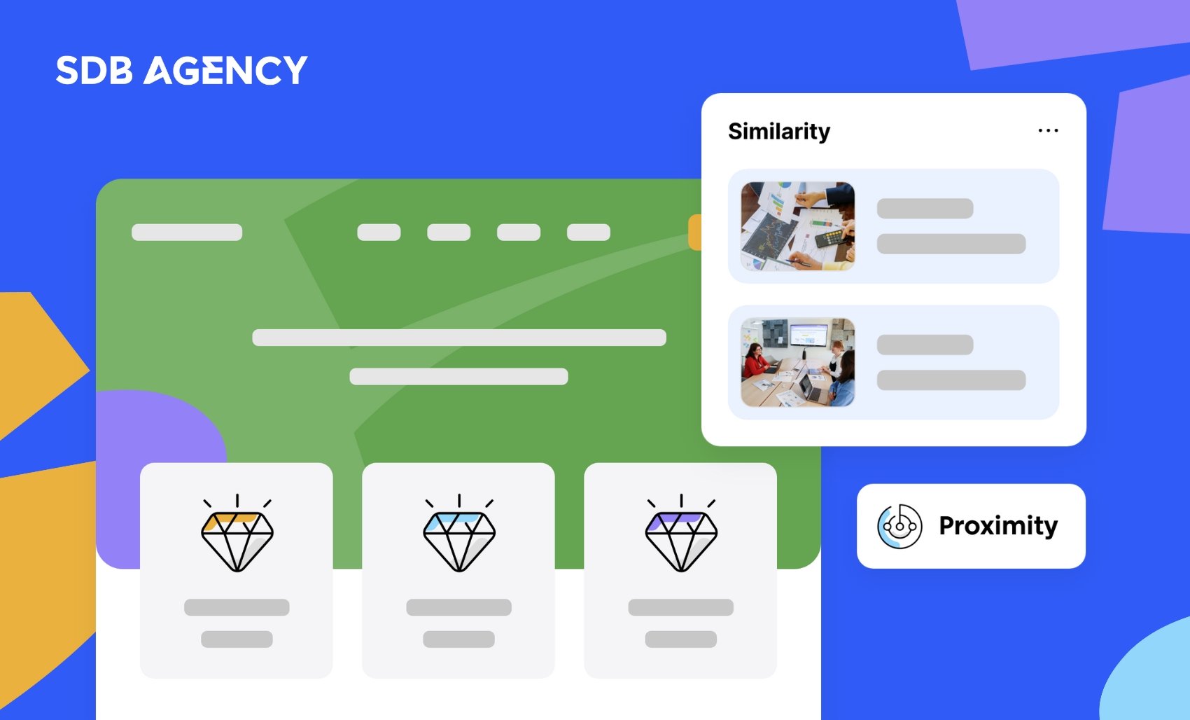
- Proximity – this principle refers to how we tend to group specific elements that are close to each other and consider them as a single item;
- Similarity – elements that are visually similar due to color, shape, and other features are usually grouped together;
- Continuity – our minds tend to follow specific directions or paths. So, using the continuity principle can help guide users to a particular element or page;
- Closure – our brains like to process a single image better than multiple objects. So, even if an element is missing, users will still perceive the bigger picture as a whole unit;
- Connection – this refers to how we people tend to group elements that are connected, something like a large painting fragmented into three sections.
Sticking to what’s familiar

We like to stick to what’s familiar, so we tend to choose things we know over things we don’t. Think about going to your nearest coffee shop; you’ll likely order something you’ve tried before. In psychological terms, that’s explained by the exposure effect, as humans gravitate to things they’re most familiar with, even if there isn’t any reason to trust a product.
People have a tendency to use previous experiences to “protect” themselves and avoid things they don’t have experience with. However, we can develop familiarity a lot faster than you think. Regularly encountering something without experiencing it can establish a sense of familiarity in the mind. These ideas are highly relevant to UX design.
Even though too much familiarity can be overwhelming, it’s best to mix it with new elements to keep things exciting. However, too many new things can be frightening, activating the fear of the unknown. Designers must focus on delivering the perfect balance of unfamiliar and familiar design. For example, a new form of navigation will become less scary when combined with the regular way to scroll.
To put it simply, giving users wildly innovative designs is a big no. Even icons like the hamburger symbol on mobile took time to get used to. Despite that, user experience continues to evolve, and something that might seem unusual for users today might be the norm in the near future.
Maintain consistency

Users expect to find specific things when visiting a site. For example, they want to scroll down and click something for more information. Horizontal presentation is comforting as it lets users absorb information gradually, which calms the mind. This way, there are fewer distractions, which allows users to focus on new information. When designing a pleasant UX, it’s important to maintain consistency.
Our minds save power by reading faster and scanning key points. Designing boxes that emerge from one side to another may overload the brain. Instead, find ways to attract users with various colors and text that flows from side to side. These formatting tricks help in creating a sense of urgency, and users will want to acquire all the information from the page.
The symbols you use to display your content and the fonts you use may also give your design a pleasant feel. However, stick to a maximum of three fonts so users won’t be distracted. Always place shapes and words together when labeling items. Your users will absorb information better when there’s a clear pattern to identify. Good use of white space can also help users interpret data more effectively.
Memory biases

Have you ever had a long conversation with a friend and felt like they weren’t entirely listening? It turns out that’s just human nature. Our attention spans can time out, and we may only remember parts of a conversation. This also applies when users browse a website, especially when they’re going through a lot of information.
In psychology, there’s a term known as the “recency effect,” which means that the most recent information will receive more attention. For user experience design, this means the information presented last will likely be most remembered.
On the other hand, there’s also the “primary effect.” This is the complete opposite, as it’s where the information first presented will get the most attention. In this case, our minds can store initial items more effectively, and information at the beginning has a bigger chance of being remembered.
Both effects should be considered when distributing information throughout your site. Therefore, we think your most important information should appear at the beginning and end. We’re not saying to avoid information in the middle completely; it would just be less likely to stick in the user’s memory. Make sure to organize your content accordingly so all the critical information will stay in users’ heads for longer.
Get to know your users to create exceptional UX
Even if you aren’t an expert in psychology, understanding the basics can help you design better UX. Tapping into users’ unconscious minds can have benefits when designing a website. Whether you’re focusing on the layout, visuals, or content, understanding psychology helps you establish a base on which to work. However, remember that the human mind can be extremely irrational.
Learning more about your users can improve your site’s UX. A genuine interest in users lets you understand their behavior, so prepare your variables and begin your UX research.
Frequently Asked Questions
What are some key psychological principles used in UX design?
Cognitive load reduction, which simplifies user tasks, and Hick’s Law, which minimizes choices to speed decision-making are some of the main psychological principles in UX design. Additionally, consistency, feedback, and visual hierarchy guide users intuitively through interfaces.
What role does cognitive load play in UX?
This refers to users’ mental effort to interact with a product. Minimizing cognitive load leads to a smoother, more intuitive experience that helps users accomplish tasks efficiently and with less frustration.
How can understanding decision fatigue improve UX?
Understanding decision fatigue helps UX designers simplify choices, reduce user overwhelm, and make interactions smoother. This leads to better user satisfaction and higher conversion rates.
Need help improving your SaaS site or product? Get in touch! We can help.

Over 10 years of experience in SaaS UX design, built 150 projects, owns two SaaS businesses in the iGaming space, and is passionate about tennis & books.