The Art of Dark Mode: Enhancing User Experience and Aesthetics
Key takeaways
- Dark mode enhances comfort and usability, especially in low-light environments.
- Designers should follow accessibility standards to maintain contrast and clarity.
- Dark mode can improve focus, reduce glare, and extend battery life on modern devices.
- Not all content is suitable for dark mode—test readability and visual balance carefully.
Dark mode has revolutionized UI design in recent years. People love its sleek, stylish appearance, which has become more than a trend; it’s a user-centric design choice. In this article, we’ll dive into the world of Dark Mode and find out why it is more than just a stylish option.
The rise of dark mode
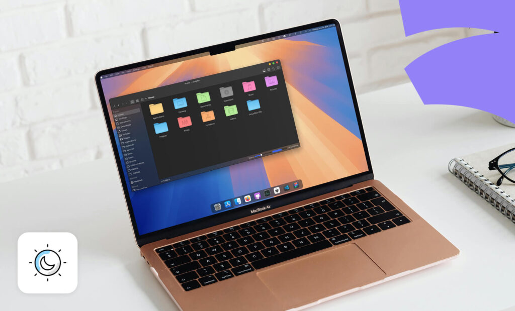
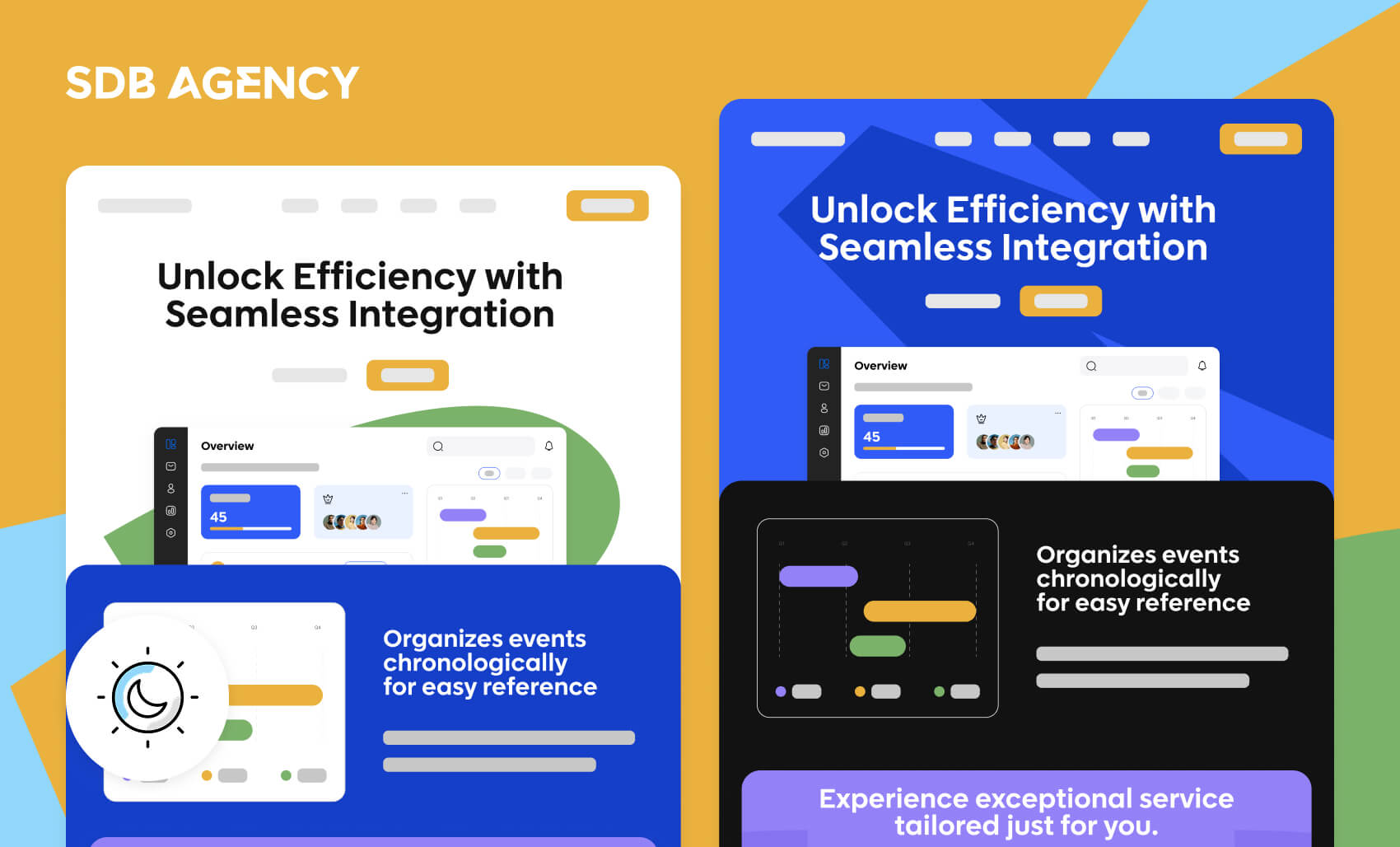
Dark mode, also known as night mode, is the inverse of the traditional “light mode” theme. Instead of the black text on a white background, dark mode features light-colored text on a dark background. This program setting became popular due to its numerous benefits, especially for those who spend extended hours on screens.
Microsoft was one of the first companies to introduce dark mode with its Windows 10th Anniversary Update back in 2016. The move marked a significant shift in UI design and aimed to provide users with an alternative viewpoint that may reduce eye strain and improve usability in low-light environments.
By 2019, the launch of iOS 13 and Android 10 included dark mode, which millions of mobile users worldwide use. This widespread adoption across major operating systems shows its growing importance in the user experience sector.
The benefits of using dark mode for user experience
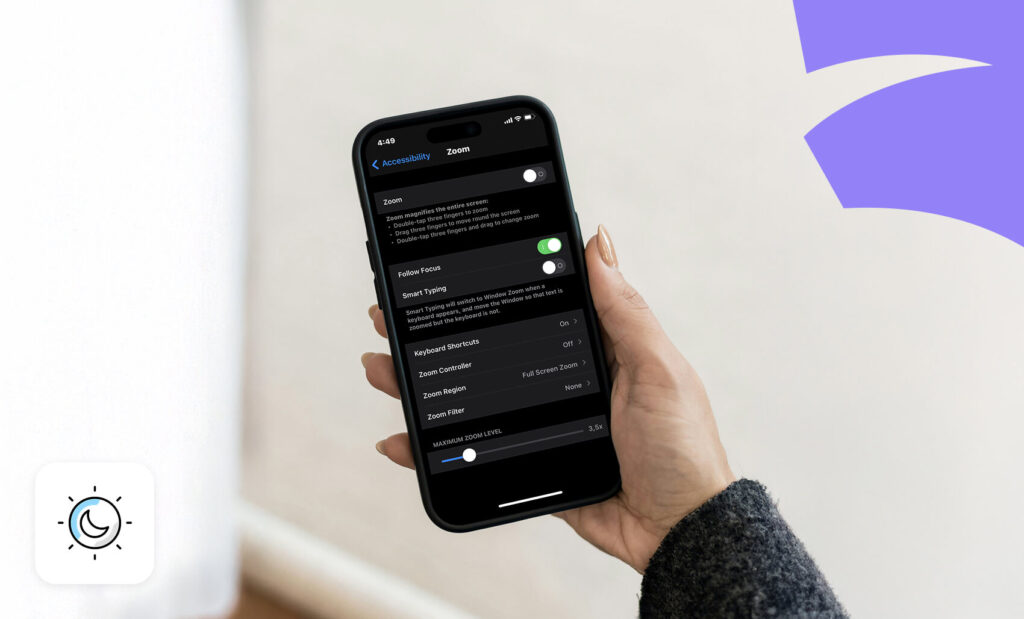
Dark mode’s many benefits elevate device functionality and user well-being. Its features offer a range of advantages that significantly improve how users interact with their digital devices. Let’s explore these benefits in detail.
1. Prevents eye strain in low-light conditions
Dark mode reduces eye strain, especially in dim locations like a dark room or workspace. It reduces screen brightness and replaces bright backgrounds with soothing dark ones, reducing harsh blue light emissions.
This change is healthier for your eyes, preventing fatigue commonly caused by prolonged screen time.
2. Improves focus and productivity
A darker interface allows for better focus due to fewer distractions and helps improve concentration, particularly in low ambient light. This leads to improved productivity, as users report increased focus when working on specific tasks like coding or writing in dark mode. It also minimizes visual competition on the screen.
For example, gamers and coders prefer dark mode as it reduces glare, reduces eye strain, helps them focus on specific tasks, and makes each session more comfortable.
3. Reduces screen glare
Dark mode decreases screen glare, reducing eye strain and making viewing tasks in bright or well-lit areas easier. This lets users enjoy a comfortable and consistent viewing experience across multiple lighting conditions.
For example, dark mode can help users reduce glare when reading or writing documents in Google Docs, especially in low-light settings. It also minimizes blue light exposure, which improves sleep quality during screen time in the evening.
How dark mode enhances user experience
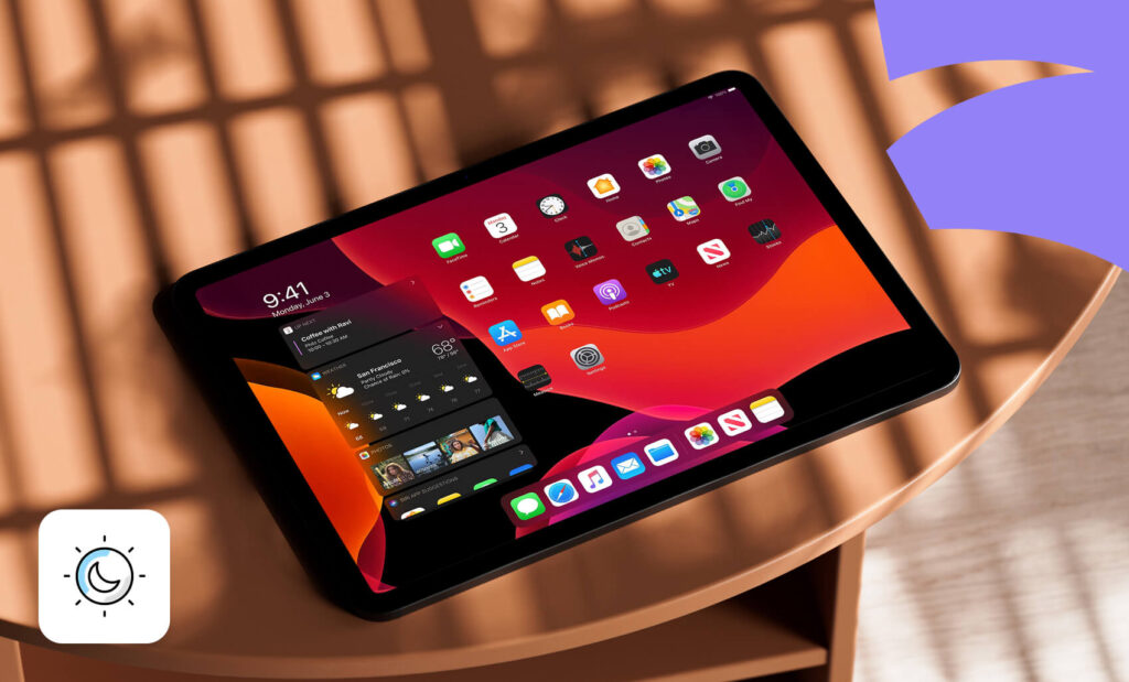
Dark backgrounds create a soothing user interface that elevates the user experience. Here are the reasons why developers and UX designers implement dark mode to improve the user experience.
1. Improves reading experience
Even though the traditional dark text on a light background has been the standard for readability, dark mode introduced an eye-friendly and high-contrast alternative that is more comfortable for the eyes, especially in dimmer environments.
Dark mode emphasizes high contrast between background and text, elevating legibility without sacrificing aesthetics. This enhanced legibility is also vital during onboarding when users are just discovering the app’s functionalities. It may be crucial for content with heavy interfaces, where bright screens may make the experience more overwhelming.
2. Boosts accessibility for various needs
Dark mode improves accessibility by offering better contrasts between backgrounds and text, making it easier for readers with specific visual needs, including users with visual impairments.
Conduct thorough user research to understand these diverse needs and ensure that dark mode settings are accessible. This approach will ensure that people of all ages and abilities feel welcome to use your product and accommodate all their visual preferences and needs.
3. Improves clarity and ease of use
Clarity in dark mode means that users will quickly find and interact with essential elements on the website. A clear visual hierarchy and high contrast ensure a more straightforward navigation experience, which reduces cognitive load and improves user satisfaction.
This creates a more seamless user experience and allows them to find what they need without frustration. Dark mode is aesthetically pleasing while promoting better usability and user engagement.
For example, dark mode lets e-book readers enjoy their books at night without straining their eyes, creating an exceptional reading experience.
When Dark Mode Doesn’t Work
While dark mode offers many benefits, it isn’t a perfect solution for every interface or audience. In some cases, dark mode can actually decrease usability and accessibility if not thoroughly tested. For example, text-heavy websites like blogs, documentation pages, or news portals can become harder to read when long blocks of light text sit on dark backgrounds — leading to quicker visual fatigue for some users. Likewise, brands that depend on bright, colorful visuals may find their imagery appears dull or distorted in darker themes.
Dark mode can also create contrast and readability issues if designers don’t follow accessibility standards (WCAG recommends a minimum contrast ratio of 4.5:1). Excessive use of pure black backgrounds or highly saturated accent colors may cause glare or vibrancy problems on various screens.
Additionally, users in brightly lit environments — such as offices or outdoors — often find dark mode more difficult to read because of light reflections. That’s why the best approach is to give users control: let them switch between light and dark themes or automatically match system preferences.
The future of dark mode
As dark mode continues to rise in popularity, it is poised to become a fundamental aspect of UX design. With growing user demand for the ability to switch to dark mode, designers and developers will need to treat its integration as a standard practice. Ongoing refinements and innovations in dark mode design will likely enhance user experiences and create new creative solutions.
Additionally, dark mode may become even more adaptive and customizable as technology evolves. Users could gain the ability to fine-tune darkness levels or enable automatic adjustments based on ambient lighting or time of day. This heightened level of personalization will empower users to tailor their experience to their specific preferences and needs.
Conclusion – implement dark mode in your UX design today!
Dark mode isn’t just a passing trend—it’s a powerful feature that enhances user experience, improves accessibility, and caters to user preferences. By incorporating dark mode into your digital strategy, you commit to user comfort and flexibility.
The key is to offer dark mode as an option rather than enforcing a single display style. Allowing users to choose between light and dark modes ensures a more personalized experience.

