Color Palettes and Typography in Mobile App Design
Key takeaways
- Color and typography in apps can affect users’ moods, behavior, and stress levels, which in turn influence how they perceive your brand message.
- Essential color principles for mobile include choosing colors that evoke specific emotions. You can do this by checking what your competitors use, but don’t replicate them.
- Typography is vital for apps as it elevates a clean look. Companies like Apple and Google offer free fonts that you can use.
Every year, a new mobile app design color and typography trend emerges, which is why we regularly see apps with standardized color schemes and fonts appearing simultaneously.
However, designers must follow long-lasting rules when choosing colors and typography for apps. For example, the principle of using only two to three colors is a design concept that has remained significant over time.
Studies show that up to 90% of users judge an app solely by its color, while poor typography can frustrate users, causing them to leave your website or app. Therefore, it’s crucial to consider the colors and typography you choose when designing apps. These can influence users’ moods, stress levels, and behavior, shaping how they perceive your brand message.
Besides app functionalities, the color scheme is the next most important factor in effective UX and app performance. In this guide, we’ll share our tips for choosing the right colors and typography for your mobile app design. Let’s kick it off with the principles of color choices.
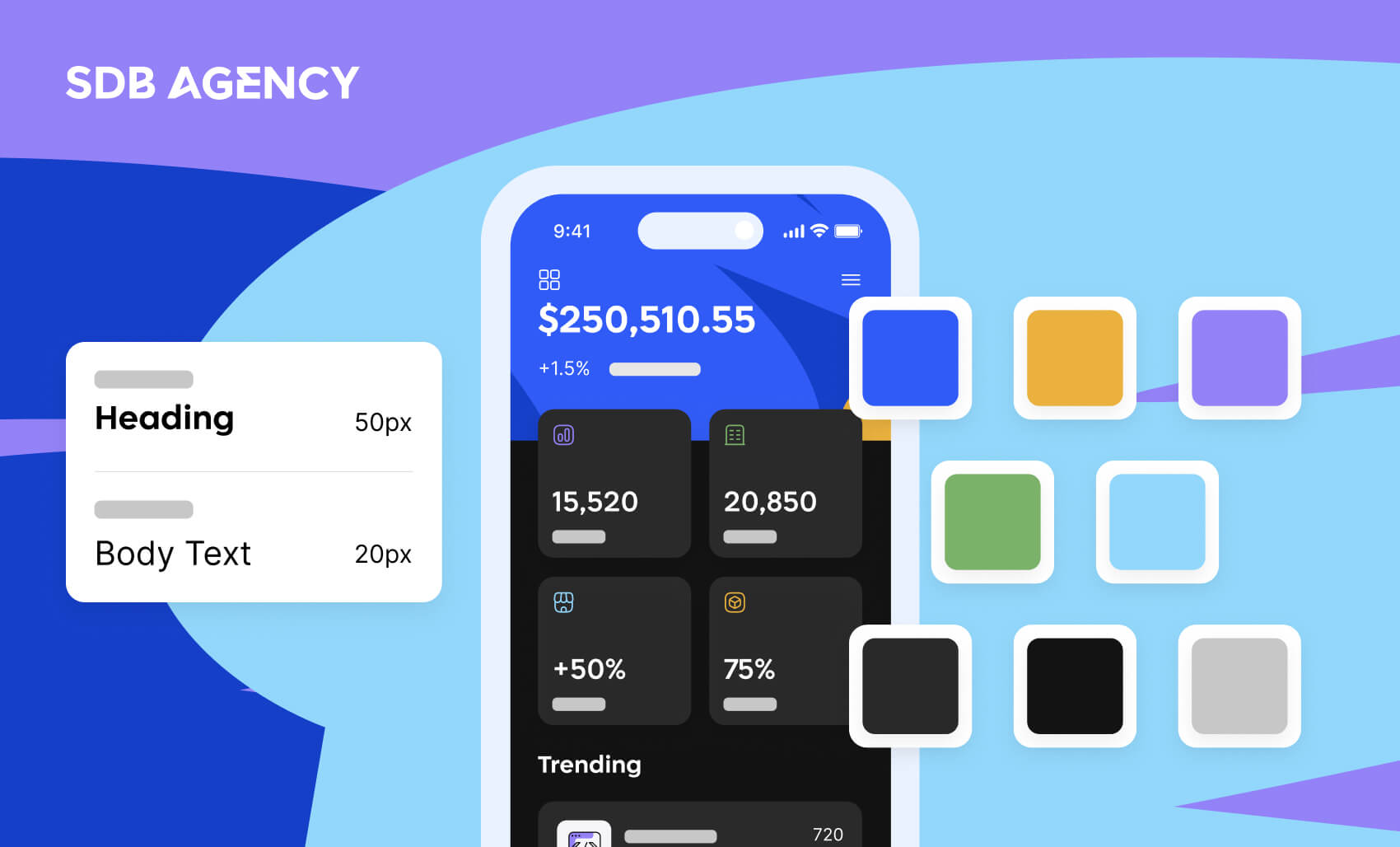
4 color palette principles for mobile design

Have you ever seen a black-and-white app? We’re guessing no.
Even the simplest apps with monochromatic schemes have at least two shades of color. These chosen color patterns encourage brand recognition and user participation. You don’t need to be a specialist in color theory to pick the right color for your brand, but if it isn’t well thought out enough, you may risk sending the wrong message to your audience.
In this section, we’ll go through the basics of captivating proper app design colors to make things easier for you.
1. Choose the color that evokes a specific emotion
People tend to evoke a particular emotion when looking at specific colors. For example, blue represents trust and reliability. Red corresponds to energy, speed, and urgency. Orange expresses fun and action, while pink shows femininity. Green signifies wealth, and black expresses sleekness and elegance.
Note that color associations are cultural. Therefore, it’s important to know your audience when choosing a color palette for your app.
2. Check the colors your competitors use
Mobile app design isn’t only about the app icon. However, app store reviews of app icons will provide a good starting point for understanding what works and what doesn’t in your niche.
It’s crucial to be distinguishable, even if it means sticking to a trend and tested color palette. One way to move beyond the “usual” app design is to incorporate a stunning color scheme and add dimensionality to colors.
3. Adding the fourth “C”
App design consists of three C’s – consistency, clarity, and content. When choosing the fourth C (color), it’s essential that it elevates the content and functionalities.
The color scheme should be part of your app’s visual interface, interaction, and system design. Incorporate your chosen color patterns in the user behavior and flow. Consider the interface element’s interaction and how your app works in the product and website ecosystem.
4. Begin with the basics
This is about primary and secondary colors, UI hierarchy, background, and surface, as well as communicating with your color options.
Use colors to establish a clear visual hierarchy with contrast and flow. Define structure and guide navigation paths. When unsure, aim for simplicity—let minimalism lead the way. Reserve bold color contrasts for distinct functionalities.
With the many mobile app design tools available today, designers can easily combine essential principles with creativity to produce innovative and exciting designs.
Now that you know the essential factors that determine why color matters in mobile app design, let’s move on to typography and how the two elements create the ideal mobile app for every user.
The importance of typography in mobile apps

Designers must follow specific mobile typography rules when designing mobile app designs. This will ensure an easily understandable app and offer better UX and user interface design. In mobile app design, typography refers to how text looks, such as font, size, color, and layout.
Selecting effective typography for mobile UI design enhances an app’s clean look. Numerous resources are available for inspiration when selecting an appropriate font; companies like Apple and Google offer free fonts, including various serif and sans serif typefaces.
For example, Apple’s apps use default fonts. New York is a serif font, and San Francisco is a sans-serif font with additional variants. These fonts can inspire you to find the right one.
Creating contrast for color combinations and readability
Human psychology often perceives nearby objects as part of the same group. This makes proper spacing in writing crucial for creating contrast. Correctly spacing headings and their corresponding paragraphs helps clarify which content belongs together while differentiating one section from another.
To ensure clarity, keep each heading and its associated paragraph close together while maintaining enough separation to distinguish it from other heading-paragraph combinations.
In addition to spacing, text color plays a significant role in creating contrast. High-saturation colors can hinder readability in text-heavy designs, especially on mobile. A safe choice is to stick with black or gray tones for body text. For a clean and visually appealing contrast, opt for headline colors slightly darker than the body text. This approach ensures both readability and aesthetic appeal.
FAQs on color palettes and typography
1. How many colors should a mobile app use?
Sticking to 2–3 main colors plus neutrals (white, black, gray) is ideal. Too many colors may overwhelm users.
2. Should I use system fonts or custom fonts?
System fonts are safer for performance and accessibility, while custom fonts offer stronger branding—choose based on your priorities.
3. Can dark mode affect color and typography choices?
Yes—designers must adapt palettes and fonts to remain legible and consistent in both light and dark modes.
Designer’s Checklist: Colors & Typography for Mobile Apps
✅ Limit palette to 2–3 primary colors
✅ Test color meanings across different cultures
✅ Keep typography readable (min 16px body text)
✅ Test designs in both light and dark mode
✅ Prioritize your app’s performance—avoid overloading with custom fonts
Conclusion
Color palettes and typography are more than just aesthetic choices in mobile app design—they’re the backbone of effective communication, brand identity, and user experience. The right combination of colors can evoke emotions, guide user behavior, and enhance engagement, while thoughtful typography ensures clarity, readability, and visual harmony.
As trends in mobile app design evolve, foundational principles like simplicity, consistency, and emotional resonance remain timeless. By adhering to these principles and embracing creativity, designers can craft apps that are not only visually stunning but also intuitive and user-centric.
Remember, a well-designed app goes beyond functionality—it creates a connection with users through its visual language. Whether selecting a color palette or choosing the right font, each decision plays a crucial role in the overall experience. By paying careful attention to detail and prioritizing the user, your app can differentiate itself in a competitive market and leave a lasting impression.
Need help improving your SaaS site or product? Get in touch! We can help.

Curious, rebellious learner. Passionate about design, philosophy, and psychology. Loves ice cream, family, and simplicity. Always growing through new experiences.


